Sui
UI/UX Branding


Exclusive, Not Exclusionary
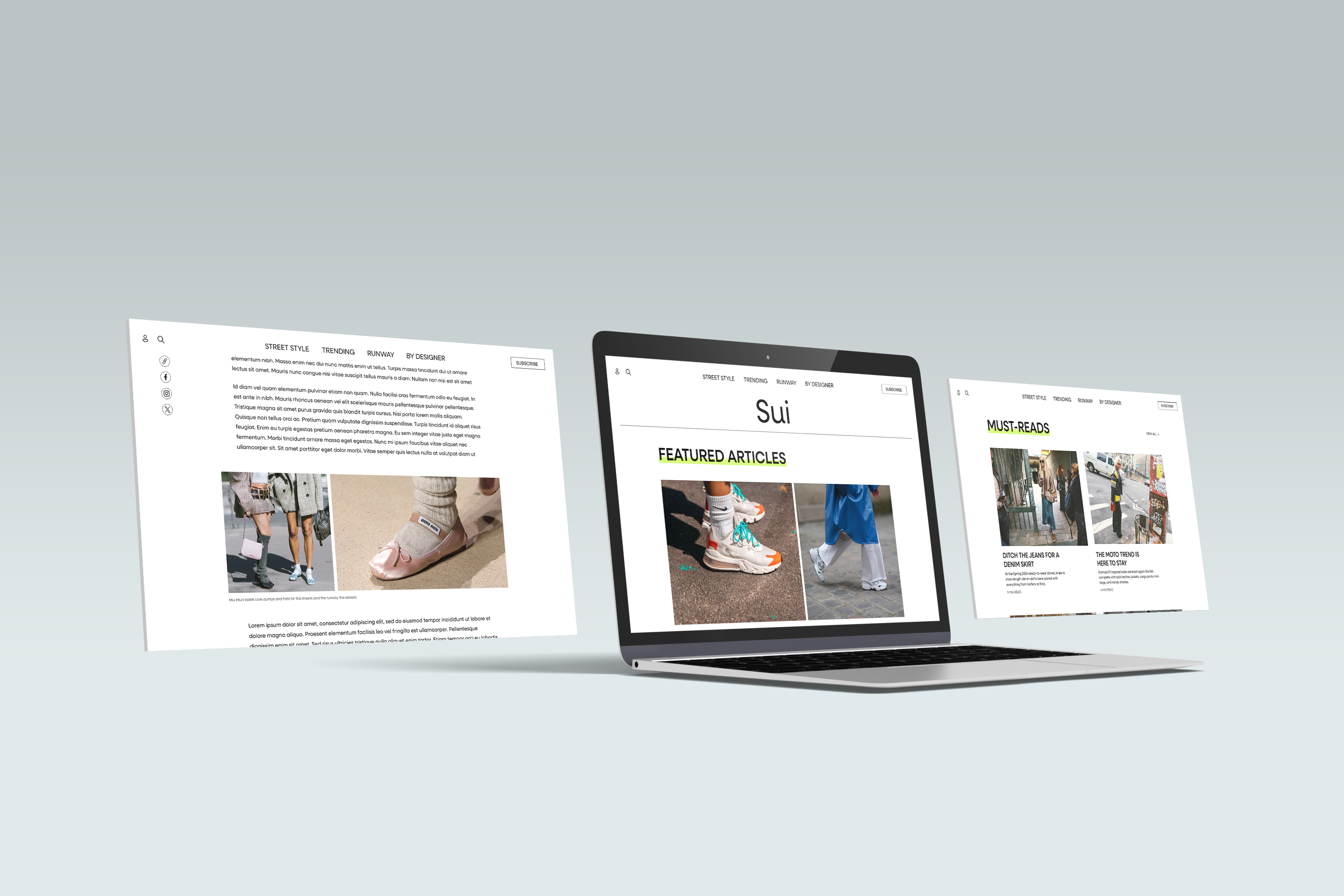
Sui is a digital fashion publication for the curious. I've always loved fashion, but it often felt exclusionary and reserved for people already "in-the-know." As a result, I decided to develop a brand that I believe is missing in the market; one that provides the latest, exclusive news in fashion without the air of privilege and stuffiness that often encompasses the industry. The visual direction for Sui takes a bold stance while still maintaining a sleek and elevated look and feel.
Role
Lead Designer
Deliverables
- UI/UX
- Identity
- Social
Project Goals
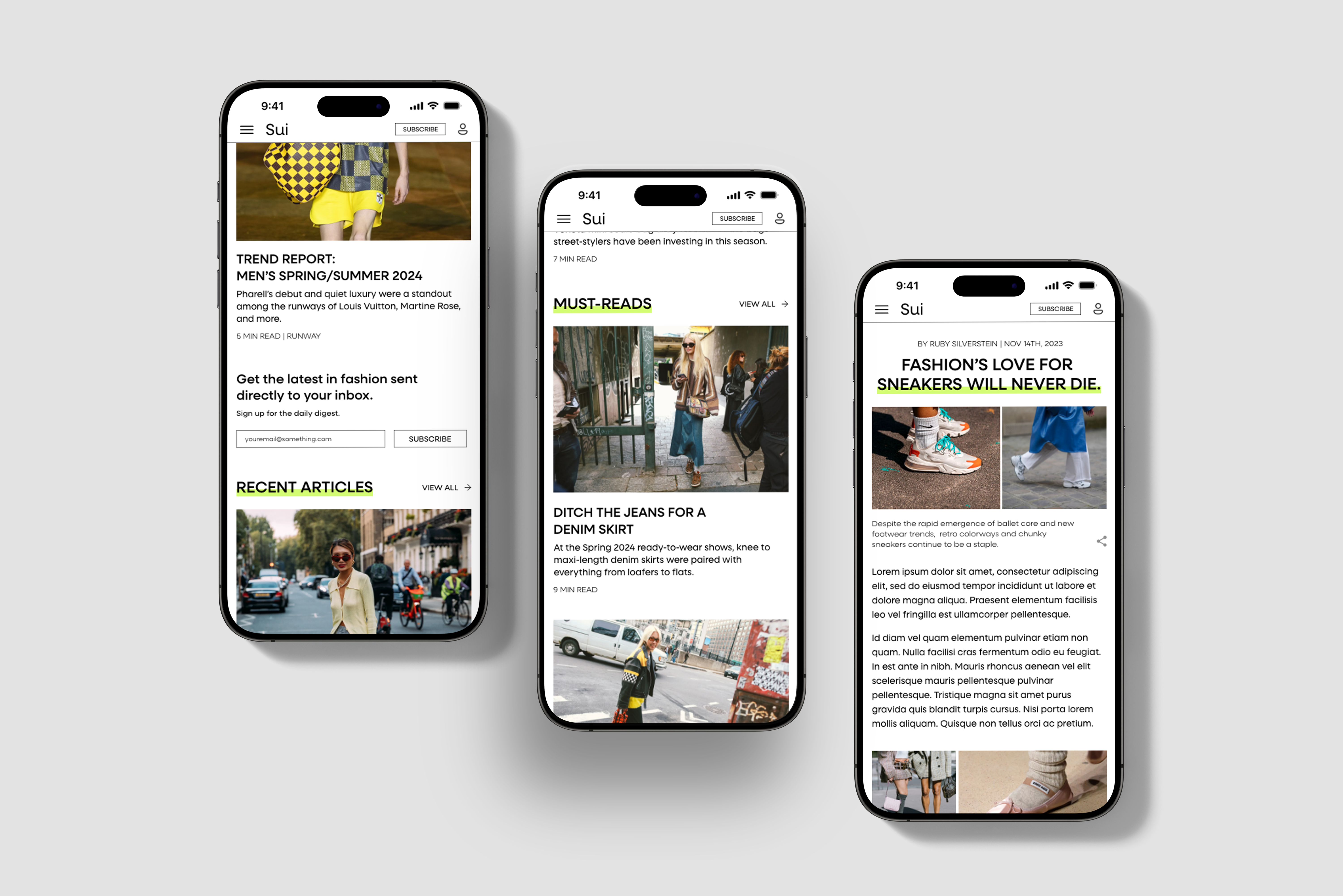
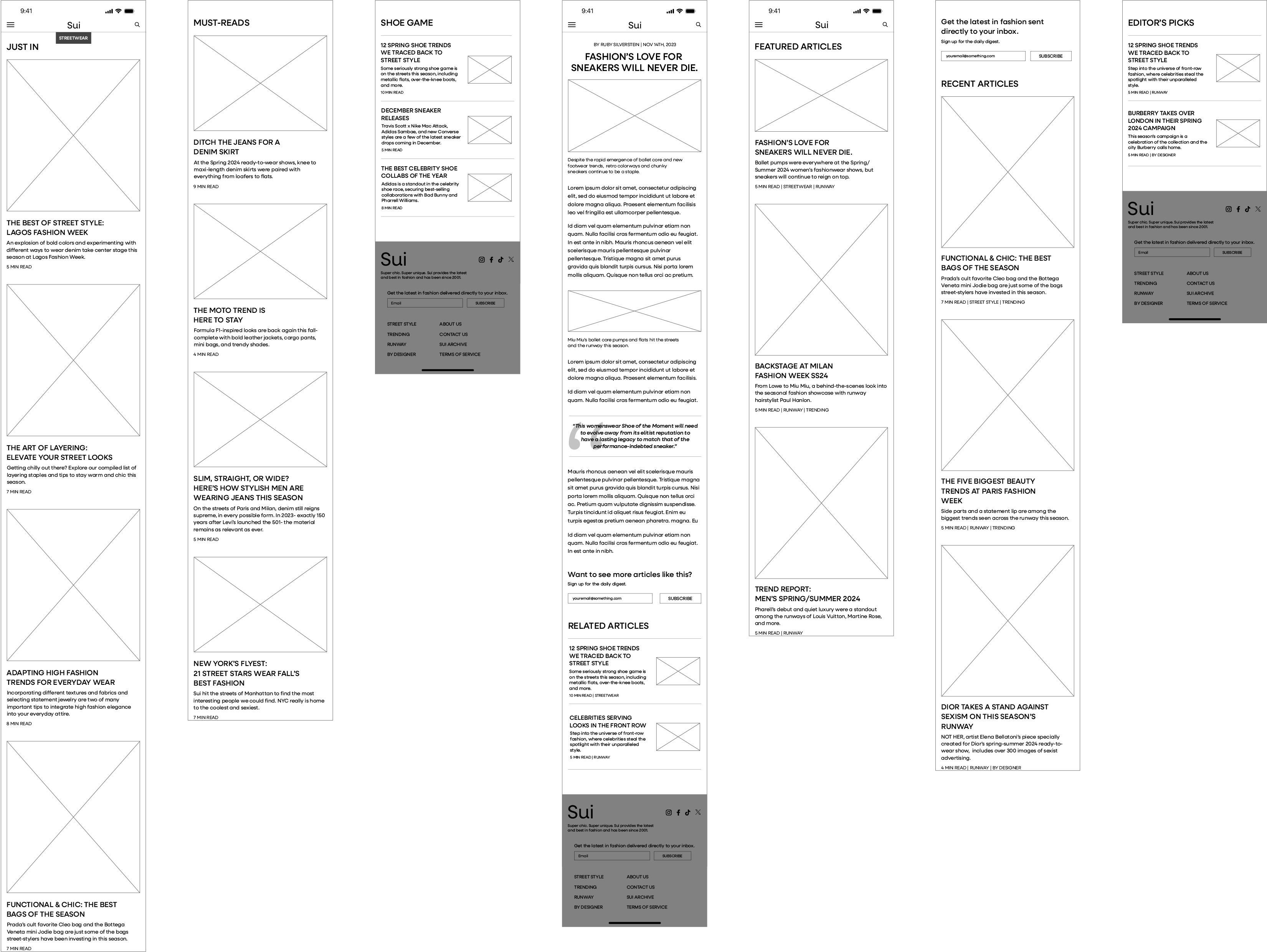
With this project, I prioritized developing a clean, engaging UI that is easily navigable and encourages users to subscribe to the publication. I knew the importance of effective, cohesive photo selection and focus on imagery throughout the site, as this is a key part of fashion and expected content for the subject.


User Personas
Through market research and personal stories related to fashion interest and information accessibility, I developed three user personas that represent distinct user segments that Sui targets.


Challenges
With this project, I learned the importance of exercising restraint. The main focus of digital publications is on the articles and their information, and my primary goal was to create a clean layout that doesn't distract from the message on the page. At times, I found myself spending too much time experimenting with visual elements, but using a limited color palette and singular typeface helped me focus on simplicity.