Shimmer Beauty
COSMETICS BRAND
For this project, the task was to develop a consumer brand that required a landing page and four email designs.
UI/UX BrandingThe primary goal was to acquire user information to turn them into leads.
Aimed to encourage users to continually interact with the brand and incentivize them to regularly purchase products.
Solution:
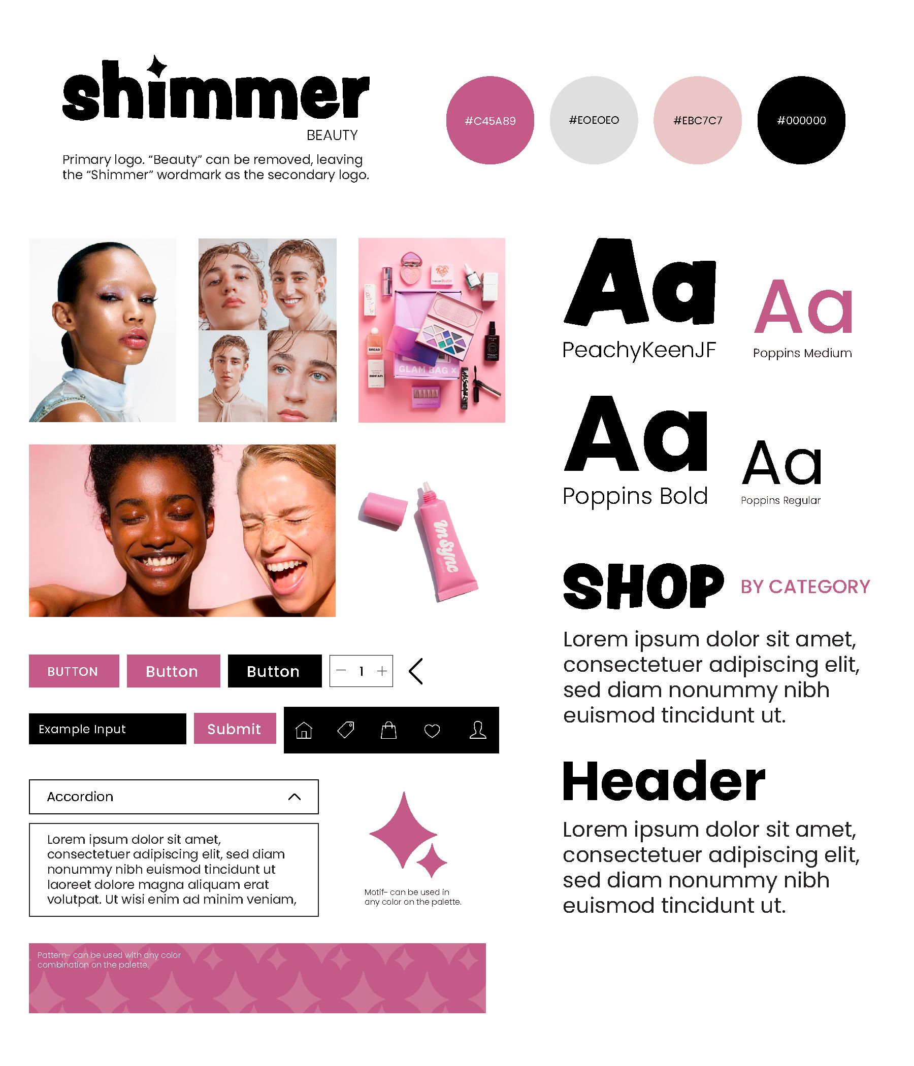
I created a beauty brand called Shimmer Beauty that prioritizes inclusivity and individuality. Shimmer celebrates freedom of expression and meets consumers where they are in their makeup journey to showcase their unique shine. Everyone deserves to be a star, regardless of their makeup knowledge, preferred style, occupation, or lifestyle.
Style Tile

User Personas


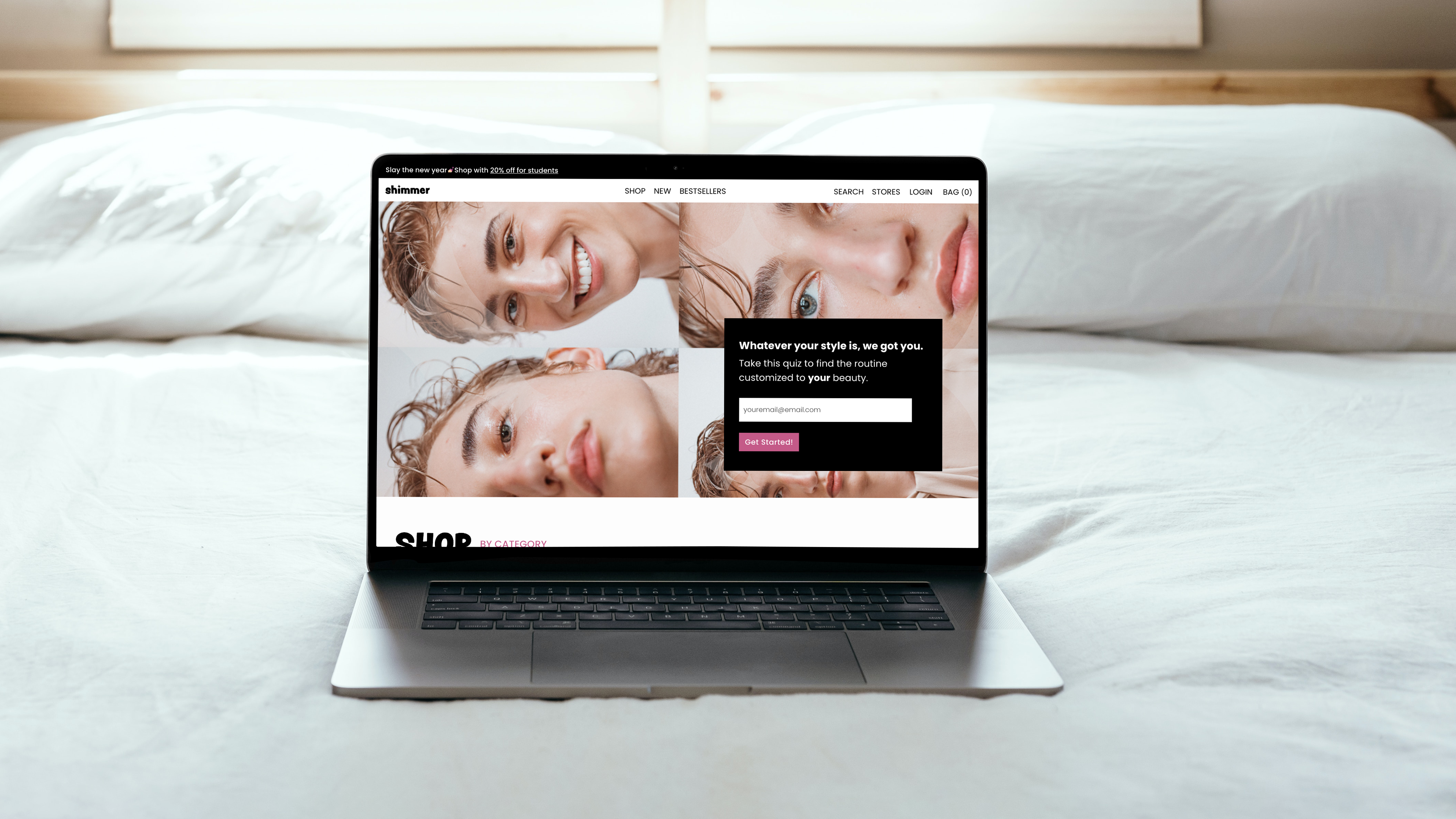
Landing Page

Project Goals
Create a landing page for Shimmer Beauty that successfully obtains user information to convert them into leads. Through the use of the style guide, develop a unique look and feel for the brand that will translate to future deliverables.
Wireframe and Flat Design

Protoype Walkthrough
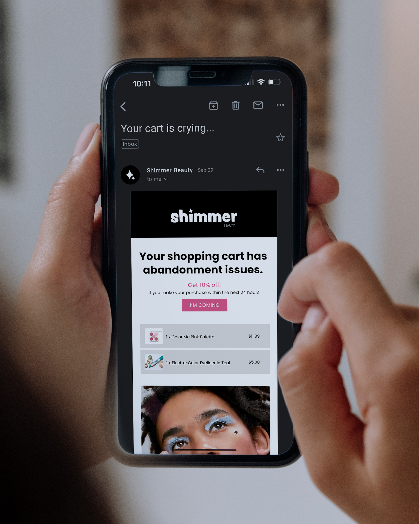
Email Designs

Project Goals
The emails aim to encourage users to continually interact with the brand and incentivize them to regularly purchase products. These would come after users sign up for email notifications on the landing page. In my research, I discovered that buttons using unique, action-oriented language have a higher click rate than those using common words like "enter" or "submit," which guided my decisions in the copy and call-to-action components throughout the designs.
Wireframes

Final Designs


Project Goals
The emails aim to encourage users to continually interact with the brand and incentivize them to regularly purchase products. These would come after users sign up for email notifications on the landing page. In my research, I discovered that buttons using unique, action-oriented language have a higher click rate than those using common words like "enter" or "submit," which guided my decisions in the copy and call-to-action components throughout the designs.
Wireframes

Final Designs
