Lillian's
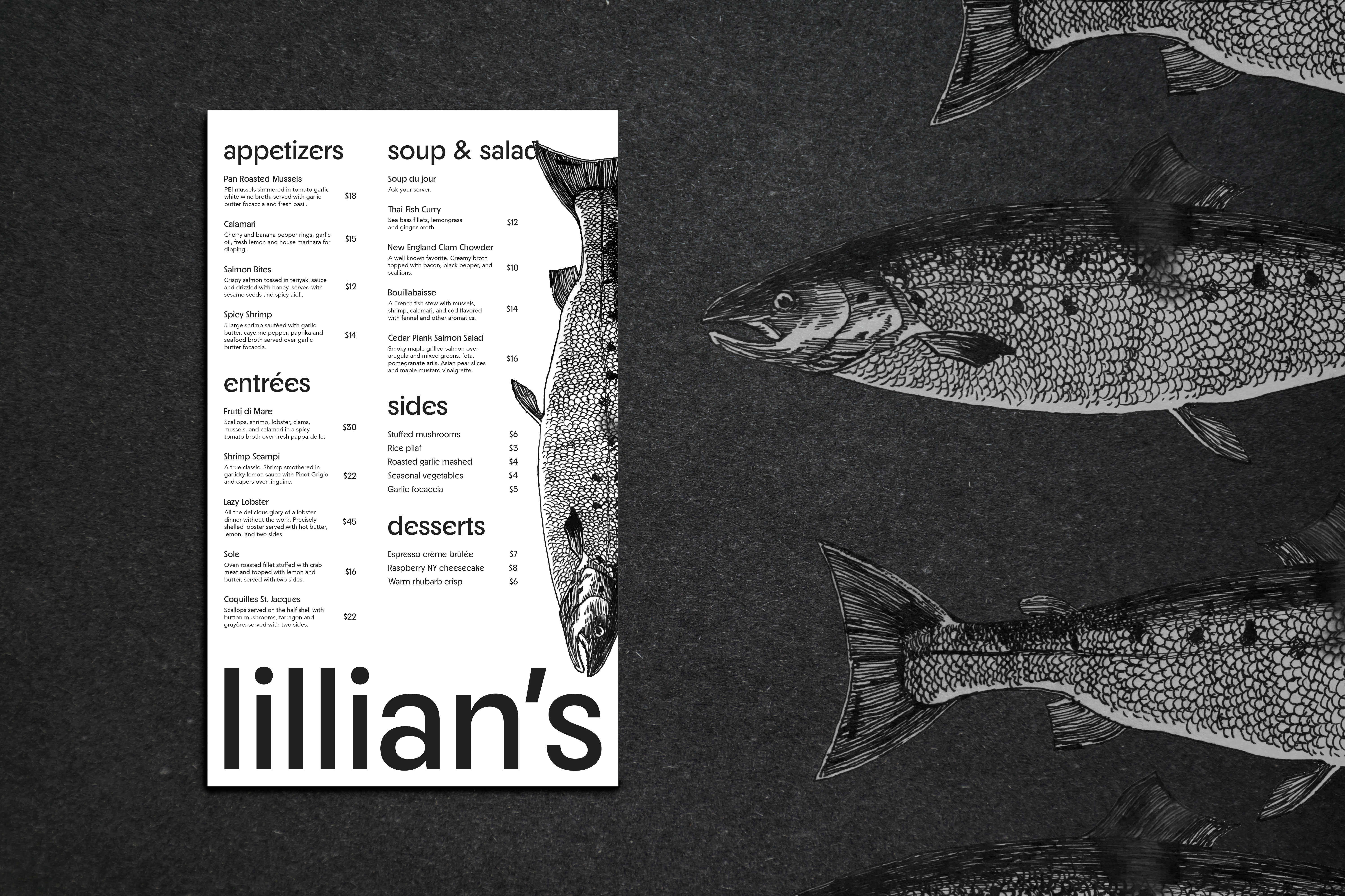
Menu design personal project for a conceptual restaurant inspired by family artwork. My best friend, Lilly, who is in culinary school, created the menu items. I wanted to explore typography treatment for print to create something simple, modern, and clean to spotlight her family art.
Print Design

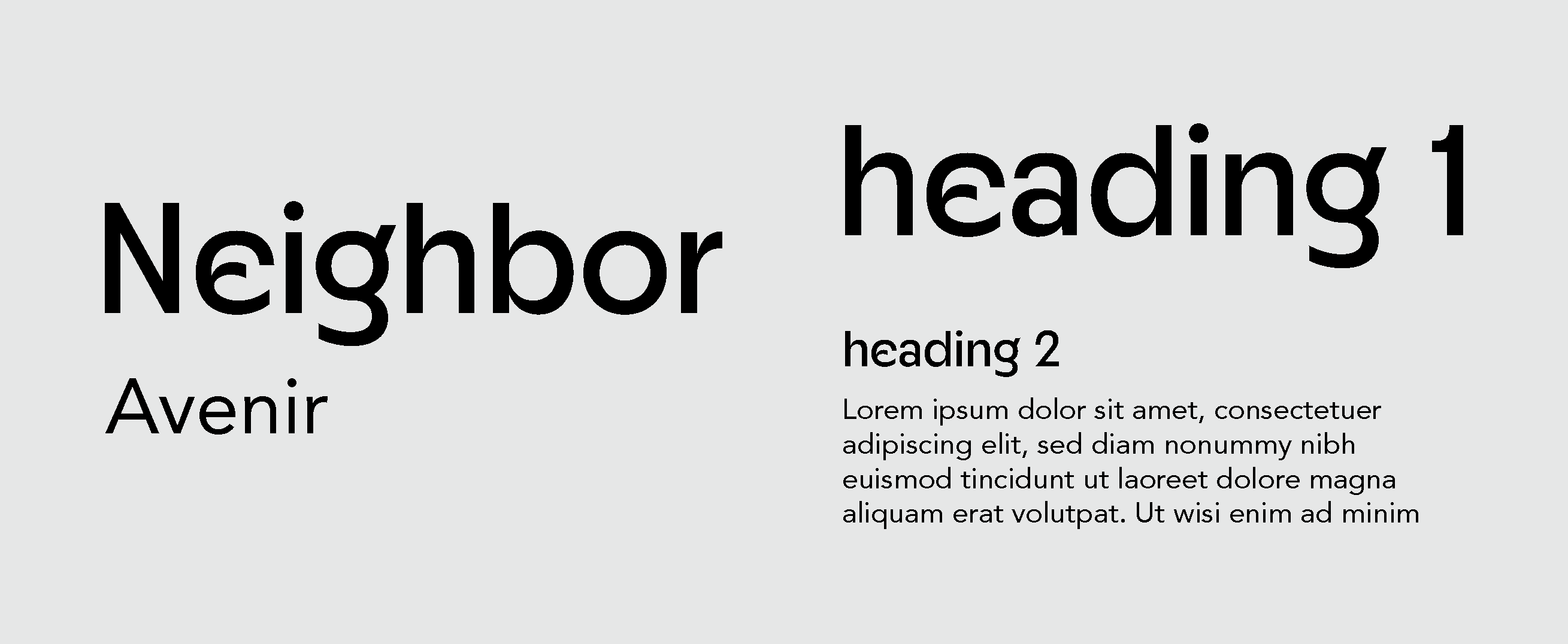
Neighbor and Avenir
I chose Neighbor as the primary typeface because of its clean, refreshing feel that also has a slight stylistic flair. To pair with this, I chose Avenir Roman because the simple, rounded sans-serif compliments Neighbor well and is easy to read.